
MDX
UX Portfolio
Work by William Friedewald
UX / UI Design by William Friedewald
Portfolio Samples From Enterprise, Web, and Mobile Application Production
My work history began with interactive design for a medium sized digital advertising agency producing proprietary interactive B2B point of sale products for large industry clients including Boeing, Cadillac, and MCI. Not long after, I engaged in UX / UI design work for Apple designing and building concept prototypes for their initial browser RnD program. This overlapped with interactive level design work for real-time 3D game development at companies like Konami and Electronic Arts. From there, I worked for a myriad of startups and established companies handling UX research and design projects ground-up as well as re-designs for improvement of preexisting products and systems. Some of which included the philanthropic sector with The Rockefeller Foundation (working with internal IT and grant processing operations), financial technology design for big data application development at American Express, online healthcare and insurance related applications, eCommerce, and financial mobile application design for a number of independent clients. The sum of which provided a variety of contexts for applied agile UX design to different developer cultures, development methods, and production philosophies.
Project Sample Contents
 Web Application |
 Stages |
 UX Research & Design |
 Mobile Design |  Tablet Design |  Industrial Applications |
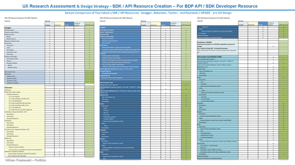
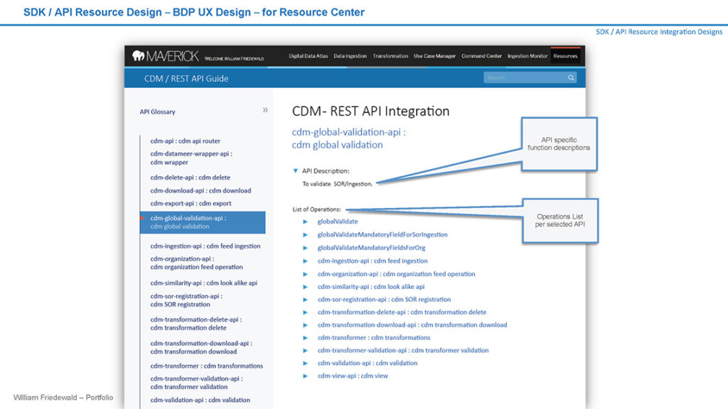
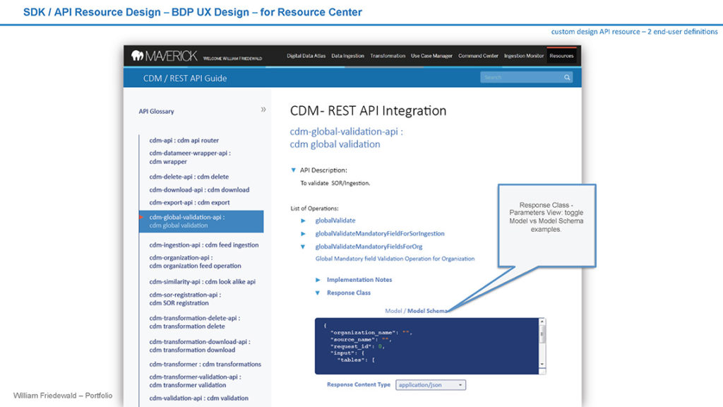
 API Dev Utility |
 Web App & Brand Integration |
 More UX / UI Design & Dev |
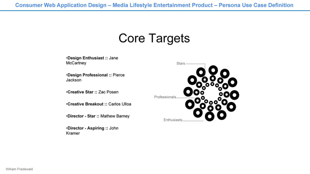
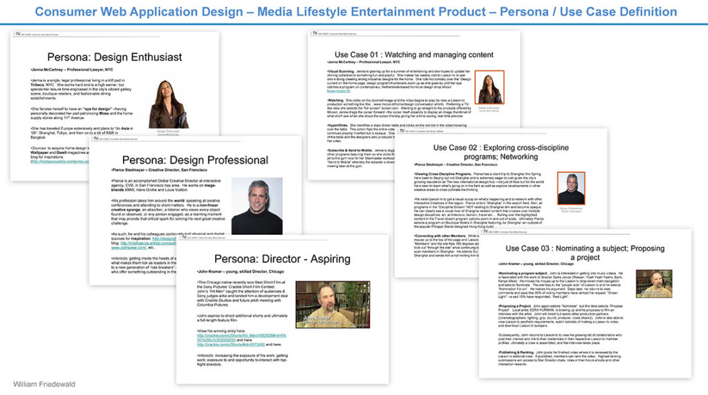
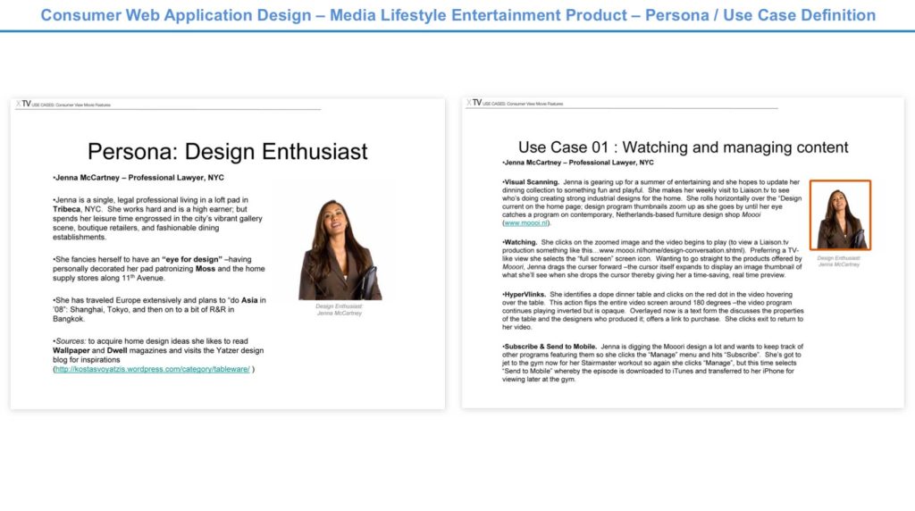
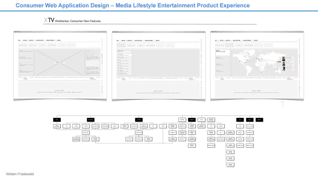

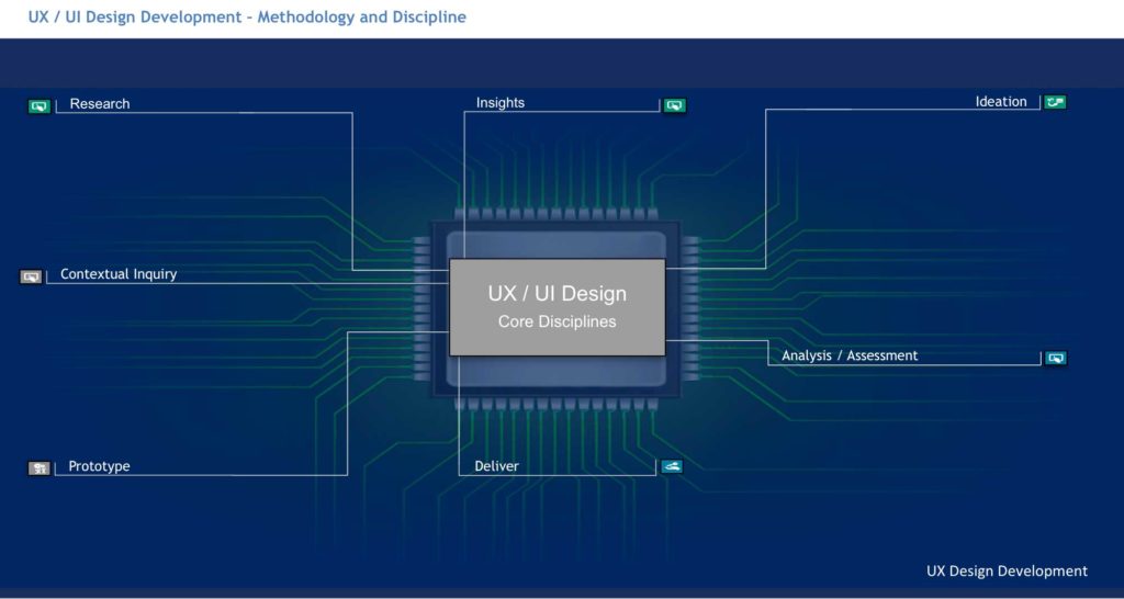
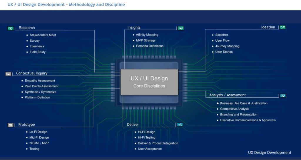
UX research and design steps adapted and implemented throughout a variety of product design projects sampled below. Thank you for visiting:
Research
Stakeholders Meet
Survey
Interviews
Field Study
Contextual Inquiry
Empathy Capture
Pain Points Capture
Synthesis
Platforms Defintion
Insights
Affinity Map
Persona Definition
Use Case Definition
Landscape Analysis
Ideation
Sketching
User Flow
Journey Mapping
User Story Definition
Prototype
Lo-Fi Sketches
Mid-Fi Design
Conceptualization Prototyping
User Testing
Comprehensive Analysis & Approvals
Business Use Case & Justification
Competitive Analysis Assessment
Branding and Presentation
Executive Communications & Approvals
Deliver
Hi-Fi Design
Hi-Fi Testing
Delivery & Product Integration
User Acceptance
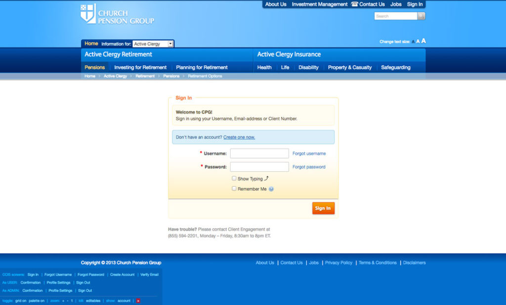
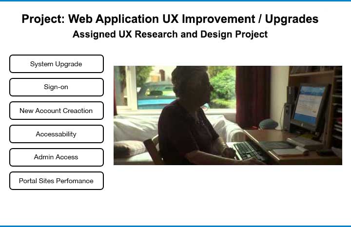
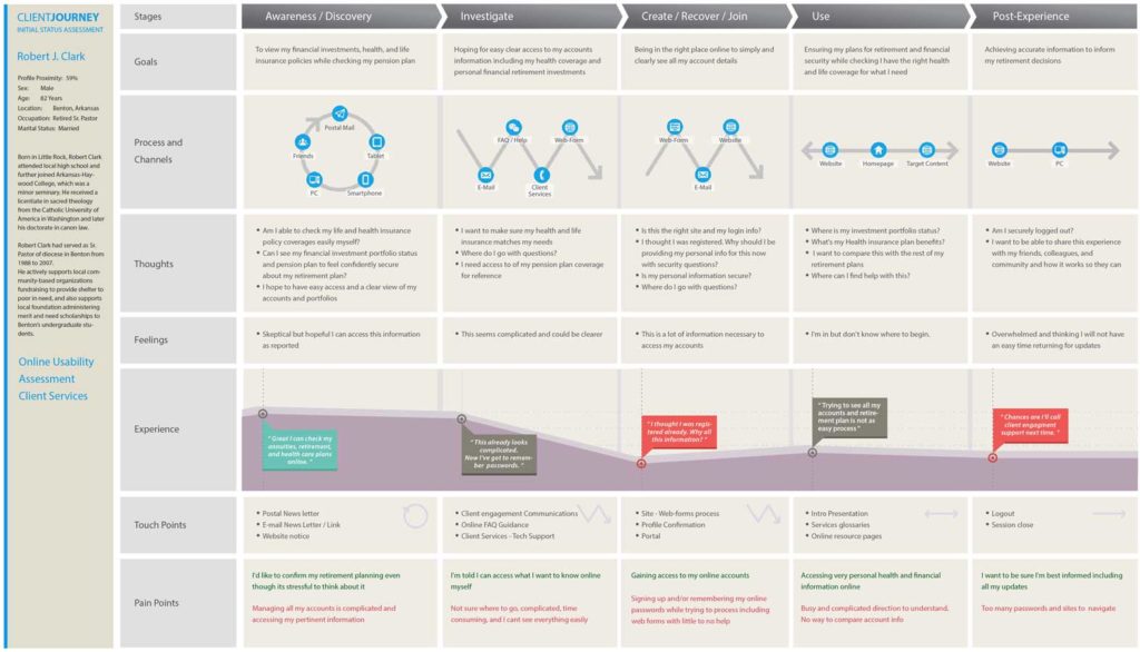
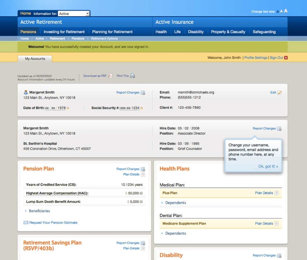
In one UX application design project, I was assigned to produce a single sign-on web access portal for clients to access their health care, life insurance, pension, retirement plans, and financial investment portfolios. Business justified enterprise-wide, this was a front to back end re-engineering of an active set of systems reaching a client base of over 44k active users. After meetings with primary stakeholders, I began 1st phase discovery via research, surveying, and case studying while setting up contextual inquiries. Through research, interviews, and direct observation, I began collecting affinity and user empathy relevant data for establishing initial personas, touch points, and pain points and got to work mapping out preliminary steps towards persona definitions and user journeys.
Biographical Information, Frustrations, Interaction & Touch Points, Goal Targets, and Motivations
Inviting select colleagues as collaborators, I was able to observe how confusing and slow the current portal systems were to an assembled focus group of client users and how much help was required from client services and customer support. With planned campaigns in the pipeline, this would stand to overload the company’s client engagement force and vastly effect enterprise wide reputation. Use cases and persona data including standard demographic and ethnographic data combined into what later refined persona definition and preliminary concept synthesis.
Charting of results and the tracking of insights followed through affinity mapping and analysis, I quickly arrived at high level journey map points and started prioritizing initial noted channels, touch points, pain points and intended use cases. I then met with relevant stakeholders to present updates and begin collaborative discussions. I noted primary shared responses, pain points, and empathy factors focusing on inconsistent log-in requirements across portals while attempting to access services. Also, issues with the complexity of account creation, lack of clear instructional guidance, and presentation of information apparently not compatible with a significant number of test users.
This lead to preliminary resources allotment discussions in preparation of more extensive feature set updates and development processing. Production options for project management and developer planning began to take shape. Ideation began by continuing the mapping out of user journeys along the user stories indicating how user flows and technical process flows could facilitate touch points and navigation as needed.
It became clear, not only would account access points and online instructional guidance require updates and redesign, but bringing accessibility to 6 separate business unit accounts under one site with a simplified login process and a comprehensive display could vastly address the client user issues -globally. This would require not only a new single sign-on experience design, but a comprehensive central presentation of information detailing these accounts on a single web page. Consequently, the project mandate focused further, guiding stakeholder discussion and deeper discovery through white boarding and low-fidelity sketches. These were, in turn, further discussed and refined to mid-fidelity for preliminary usability testing.
Using low to mid-fidelity mock-ups, early heuristic tests proved a modular display approach would fit the context while supporting a more rapid development cycle. Through surveying and capturing of these impressions, specific design refinements followed while further confirming direction.
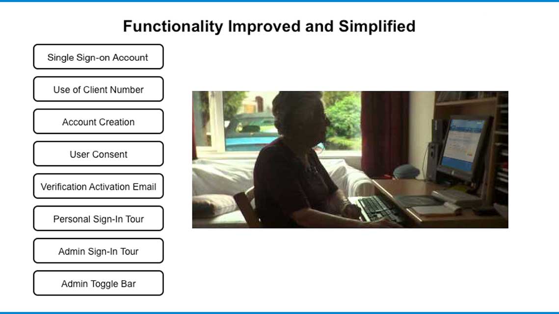
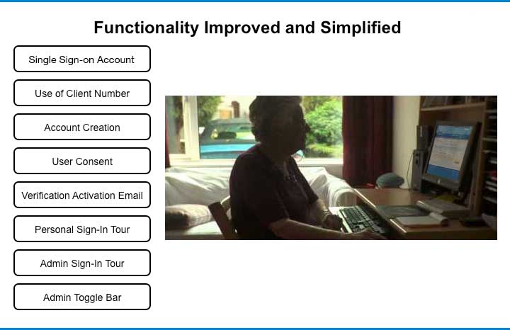
Then, after consulting with account management, System Admins, and IT department heads, it was confirmed an individual client # happened to be available, in use, assigned, and owned by each user for separate administrative purposes. This client # could also be used as universal authentication ID for the end-users. This would then enable a more simplified login procedure and account verification (per end-user profile) as well as reduce steps for online account creation. This would also maintain compliance regarding all business units including their financial investments, general data security, and HIPAA compliance requirements.
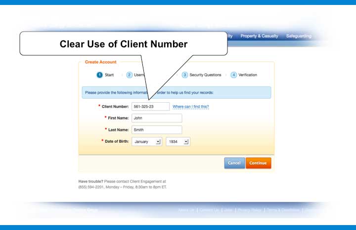
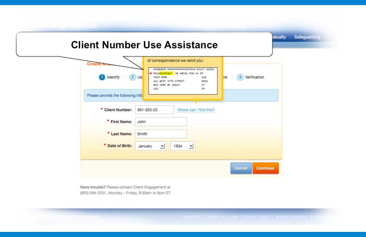
In tandem, I was able to test a modular approach to presenting the client service’s data (i.e. Health Care, Pension, Retirement Savings, Annuities, Disability, and Life Insurance plans) into separated sub-groups ordered corresponding to user profile, case, and taxonomy. These would also populate according to the specific user’s portfolio of available services.
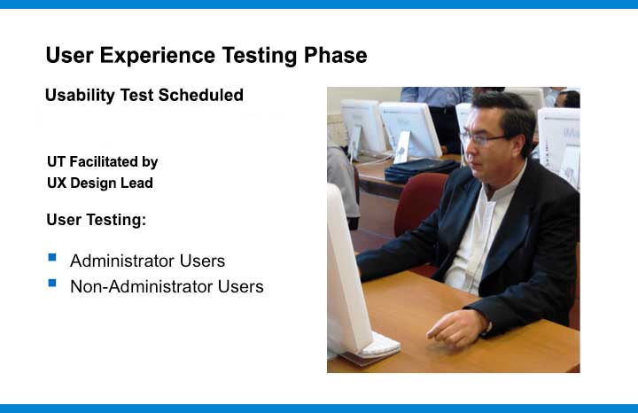
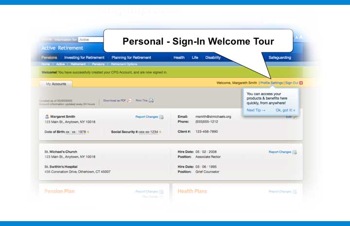
This lead to drafting further refined mock-ups (high fidelity) and a set of NFCM preliminary prototypes (non-functional clickable models), used for general and specific heuristic testing of application UI navigation, attempted touch points, efficiency of access, emotional impression response, data and information presentation, color theme, and corporate branding compliance. Testing also enabled agile prototyping of additional improvement concepts, discovered relevant to specific user groups, including an admin-user toggle bar, instructional sign-in tours, and a series of user help video guides.
In tandem, I ran comprehensive and competitive analysis including research based off synthesized concepts, leveraging preexisting best practices where applicable. On this project, confirming patent compliance was not an issue, but confirming industry standards and ensuring data security compliance per personal finance and health care information access, was. Therefore, an approval review through the cybersecurity and the legal department was also performed to confirm protocols.
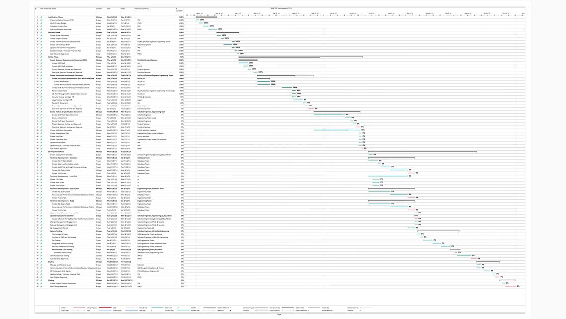
This lead to documentation and phase reporting results, insights, and assessments through the formalized enterprise wide ECM system -including mid-fi to hi-fi designs for internal circulation and final approvals. As part of the scale and transparency of the project, this followed our defined raci chart of responsible and consulting stakeholders, department heads, and production staff leadership. I then followed with comprehensive hi-fidelty mock-ups and a final NFCM leading to a functional MVP (minimum viable product) prototype accessing the network servers using staged “dummy” data to run comprehensive usability testing. This was then followed by delivery of the documented UX guidelines already informing functional requirements in phase with the technical development teams planning. Then on-call scrum support continuing the agile SDLC development process through regression testing, change management, deployment, final stage User Acceptance Testing, and all closing phases.





Insurance Retail Portal – Proof of Concept Prototype Design
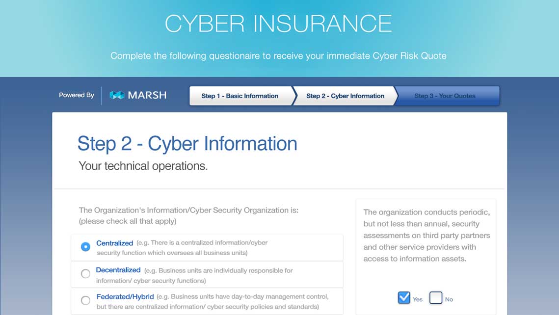
Automated Insurance Quote Generator

Additional UX / UI Design & Development

Point of Sale Consumer Sign Up & Services Product – Prototype Designed in Figma
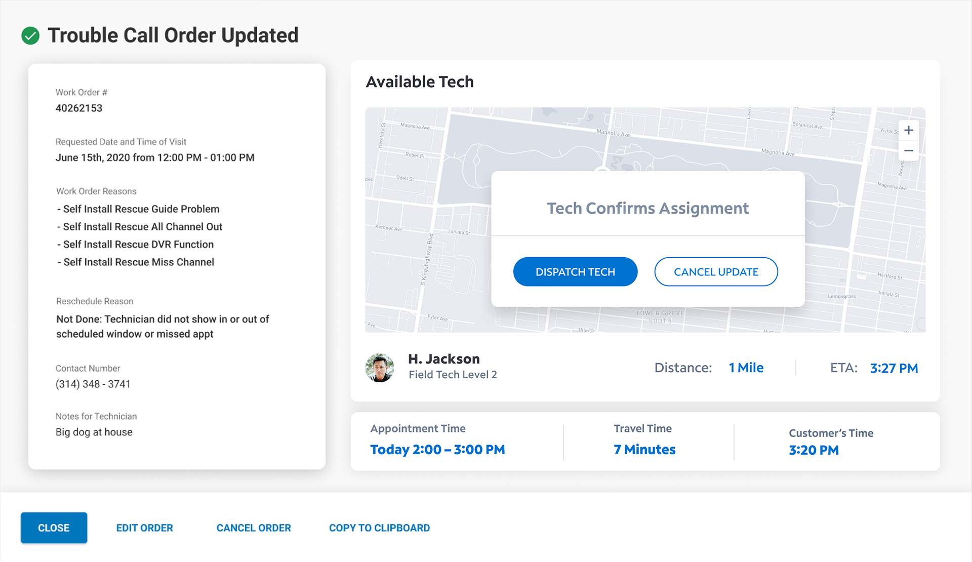
Customer Service, Install, and Repair Dispatch Management – Prototype Designed in Figma

Supply Chain Management System Product – Prototype Designed in Figma
 Web Application Design & Development |
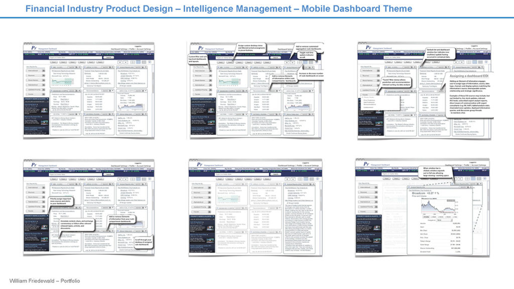
 Mobile Financial Applications Design |
 UX / UI Design & Development – Agile and Adaptive |